Hal
Glicksman
White is Green
Background
The
original impetus for my research
was to make the RGB and CMYK systems of
color understandable and useful
to art students. I created a color wheel
of the RGB system on the
computer and on paper with Windsor-Newton cyan,
magenta and yellow inks.
I created gradations of cyan, magenta and yellow
ink mixtures in tiny
flasks counting the drops with chemist's pipettes in
geometric
progressions. I made the cyan, magenta and yellow inks into
solid
watercolor blocks with gum arabic and gave them to artists and
students
to try. Even though I could demonstrate that RGB/CMYK color
could create
more colors than the red, yellow and blue (RYB) artist's
color wheel,
artists were uncomfortable with these colors without being
able to tell
me why. Students were unable to complete satisfactory
complimentary and
triad color exercises with either the inks or the
watercolor blocks.
They also could not produce satisfactory compliments
and triads in RGB
on the computer. I reread books of art instruction
looking for the
precise place in the text that physics and art diverge.
This is a
typical example from Craig Denton's1 otherwise excellent essay
on color
theory:
Color circles or color triangles are
graphic vehicles used
to organize colors. We will be using the artist's
color circle, which
relates to pigments because graphic designers
generally follow its
traditions and rules. There is another color wheel,
composed of light
primaries and their subtractive color complements,
which we will discuss
later. But, subtractive colors are obscurely named
and physically
transparent, designed to be overlayed in printing, and
wind up looking
unpleasantly acidic by themselves. A subtractive color
circle isn't
aesthetically pleasing so it doesn't help you understand how
to best
compose colors.
Luigina De Grandis, in Theory
and Use
of Color, summarizes the frustration of reconciling artist and
scientific color. She defines magenta as "a red tending toward purple"
and then says: "...the artist, not bound to the industrial primaries,
may
continue to use the reds, yellows, and blues of his or her choice."
2
Johannes Itten's statement 3 is important because his work is
considered
authoritative by artists, and because he studied and wrote
about Ostwald
in an attempt to reconcile art and science:
One essential
foundation of any aesthetic color theory is
the color circle, because
that will determine the classification of
colors. The color artist must
work with pigments, and therefore his
color classification must be
constructed in terms of the mixing of
pigments. That is to say,
diametrically opposed colors must be
complementary, mixing to yield gray.
Thus in my color circle, the blue
stands opposite to an orange; upon
mixing, these colors give gray. In
Ostwald's color circle, the blue
stands opposite to a yellow, the
pigmentary mixture yielding green. This
fundamental difference in
construction means that Ostwald's color circle
is not serviceable to
painting and the applied arts.
In the
RGB system yellow and
blue subtracted does make gray and totally
subtracted makes black. The
RGB System should satisfy Itten's
requirement. This observation led me
to concentrate on how the hue of
blue differs in RGB and RYB systems,
and why RGB color did not yield
harmonious compliments.
Experiments
I scanned
manufactured color wheels, color
wheels in books, as well as paint sample
color cards into the computer.
I asked students to duplicate their RYB
color wheels from 2D design
class in RGB. On the computer I simulated the
subtraction of yellow from
a range of blues using a 'difference'
algorithm. In the RGB color wheel
(color picker) cyan is at 180° and
blue is at 240°. Halfway
between is a blue at 210° that will
produce a green of precisely
50% value. It is this darker green that is
on artist's color wheels. The
most prevalent mechanical color wheel is
the "Artist's Color Wheel"
©1989 by The Color Wheel Company. On this
wheel the blue is
206°, slightly closer to cyan than blue. In most
texts on color the
blue is close to the 240° blue of the computer
and would not yield
a green if mixed with yellow. I then set about
understanding what
was 'right' or useful in the artist color wheel,
rather than dismissing
artists as merely obdurate and stubborn. What I
noticed primarily was
differences in value between the same hues in the
RGB and RYB systems. I
next measured the hues and values of the scanned
color wheels and
entered the hues and values on a spread sheet. These
measurements were
used to generate radar (circular) charts of the hues
and values. The
hues, measured in degrees in the RGB color picker, were
plotted on the
diameter of the chart while the values were plotted as
distance from the
center.
In May of 1995 I posted the results of this
study on the
World Wide Web as "Computer Color and Artist's Color" I
listed four
general differences between the RYB and RGB system. The most
important
demonstration in this study was a figure showing the RYB and
RGB color
wheels transformed to gray values.
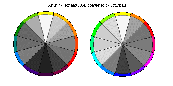 In the RYB system,
green and red are
equal in value. There is an even gradation of values
from yellow as the
lightest at the top to purple as the darkest at the
bottom. Left and
right halves of the wheel are almost identical in value.
The RGB color
wheel shows no such symmetry or evenness in value, green
of course
being much lighter than its opposite red in RGB. I concluded
that the
artist's color wheel was skewed primarily to reduce the
difference in
value in opposite colors. Understanding what was correct
and useful in
the RYB system still did not create a tool for managing the
larger gamut
of colors available in RGB, nor did it create an RGB color
wheel with
harmonious opposites and triads. I then tried to reinvent the
color
wheel by various combinations of gradations and layers on the
computer.
I created radial gradations of red, green, blue, cyan, magenta
and
yellow in which the diameter corresponded to the value of the color
and
the placement of the resulting circle was determined by the value on
the
Y axis and the hue on the X axis. I was hoping that the overlapping
of
these circles would produce a complete range of possible hues and
values
in a useful juxtaposition.
In the RYB system,
green and red are
equal in value. There is an even gradation of values
from yellow as the
lightest at the top to purple as the darkest at the
bottom. Left and
right halves of the wheel are almost identical in value.
The RGB color
wheel shows no such symmetry or evenness in value, green
of course
being much lighter than its opposite red in RGB. I concluded
that the
artist's color wheel was skewed primarily to reduce the
difference in
value in opposite colors. Understanding what was correct
and useful in
the RYB system still did not create a tool for managing the
larger gamut
of colors available in RGB, nor did it create an RGB color
wheel with
harmonious opposites and triads. I then tried to reinvent the
color
wheel by various combinations of gradations and layers on the
computer.
I created radial gradations of red, green, blue, cyan, magenta
and
yellow in which the diameter corresponded to the value of the color
and
the placement of the resulting circle was determined by the value on
the
Y axis and the hue on the X axis. I was hoping that the overlapping
of
these circles would produce a complete range of possible hues and
values
in a useful juxtaposition.
Conceptually, a spectrum of all the
hues
of RGB arrayed on the X axis combined with a gradation from black to
white on the Y axis should produce all the possible hue/value
combinations. I discovered that the pasting and layering algorithms
available on the computer did not produce even gradations or complete
sets of intermediate colors. This led to a long series of experiments
with layering, pasting, and opacity algorithms.
One of the
algorithms
I used produced a dominant peak of green in relation to red
and blue and
distorted the spectrum into what looked like a mountain
range. I
initially thought this algorithm distorted the hue/value
relationship of
RGB. In fact it was the value of the RGB colors that
were distorted, and
this chart put the hues back into their correct
value relationship.
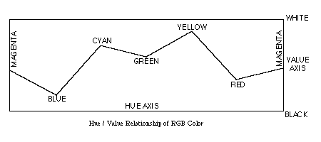
Now, instead of having a system that
would reconcile artist's
and RGB systems, I had found a system alien and
antithetical to both. The
chart of the hue/value relationship that I
produced further showed that
green comprised more than half of the total
brightness of RGB and that
white was therefor the highest value of
green.
My chart of hue/value
relationship of color also corresponds
to the dominance of green in the
spectral luminosity curve in Richard L.
Gregory "Eye and Brain" Fig 6.4
and 6.5. Of this he says "The
luminosity curve tells us nothing much
about colour vision." because
animals without color vision show a similar
luminosity curve. P.94.
Luminosity is discussed in the chapter on
brightness and not mentioned
again in the chapter on color. This to me is
like the Wizard of Oz
saying "Pay no attention to that man behind the
curtain."
Results
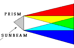
I did not wish to draw the
conclusion that
white is green, but the idea kept reasserting itself.
Several phenomena
that had been a puzzle to me now made sense, especially
Goethe's
experiments with the prism. Looking through the prism at a white
rectangle of paper, Goethe saw cyan gradating to blue on one edge and
yellow gradating to red on the other edge. If you shine a beam of
sunlight through the prism and place a white surface close to the prism
you will see a white band with this same phenomenon. As you move the
target surface away from the prism, the cyan and yellow color bands will
enlarge and the white center band will get narrower. When the cyan and
yellow overlap, green will appear in the place of white. At a greater
distance the cyan and yellow bands get narrower and red, green and blue
predominate. The diagram of this phenomena also makes sense as a chart
of
basic color organization.
Further evidence seems to reinforce my
premise: Because green carries most of the value information in RGB and
in video, the most advanced single-chip color CCD has 3 green sensors
for
each red and blue sensor. In the Kelvin temperature of light, lower
K° numbers represent red light increasing to yellow followed by
white and finally blue at the highest temperatures. White occurs between
yellow and blue in this progression, in the same place as green in the
spectrum. Green is even more predominant in the curves that represent
the
sensitivity of grayscale CCD video chips such as the Sony ICX038DLA
(chart available on the Internet5). The development of grayscale
sensitivity in film and video has a long history partly based on
empirical data from luminosity curves with some adjustment for aesthetic
preference to arrive at the current characteristics of black and white
film and video. The algorithm that translates RGB to grayscale on the
computer yields brightness percentages that total more than 100% but the
relative percentages approximate the percentages of RGB in NTSC video
quoted in Gregory6 The greyscale conversion algorithm is a useful
tool because it allows a dramatic visualization of the relation of hue
to
value. Red, green and blue must be balanced on computer and video
screens
to produce white and shades of gray. Because the hue/value
relationship
is empirically derived from measurements of human
perception and
carefully adjusted and calibrated, it follows that
information about
human perception of color is imbedded in the RGB
system for it to work.
Conclusion
A color that is 30% red 59% green and
11% blue has an underlying hue of 101° green, close to the hue of
chlorophyll. I therefore conclude that if white in the RGB is derived
from empirical data from human perception, then white in human
perception
has the hue of green as well. This corresponds to what
appeared to Goethe
in the prism. New physiological evidence about
perceptual mechanisms is
not needed to draw this conclusion, although it
might suggest lines of
inquiry for scientists, possibly even a
reconciliation of tricromat and
opponent process theory.
I would like to propose the usefulness of
"White is Green" in explaining
the hue/value relationship of color. RGB
color space is a distortion of
the hue/value relationship in the same way
that Mercator's projection
map of the globe onto a rectangle is a
distortion. Every pure hue in RGB
is defined as having a brightness of
100% when in fact every hue has a
different brightness. The artist's red
yellow and blue color wheel
creates harmonious colors only in a limited
range of hues and values.
Artists argue that harmony is subjective and
culturally determined. Even
so, once a convention or style has been
established, only very specific
colors will fit within that convention.
Matching colors and creating
variations within established limits
requires careful control of hue and
value, a task that I hope to make
easier.
References
| 1 |
Denton, Craig, Graphics for Visual
Communication, Wm. C. Brown
Publishers, Dubuque, Iowa, 1992. p
108. |
| 2 | De Grandis,
Luigina, Theory and Use of Color,
Arnoldo Mondadori S.pA., Milan, 1986.
p 18. |
| 3 | Itten, Johannes,
The Art of Color, Reinhold
Publishing Corp, New York, 1961. p
23. |
| 4 |
Gregory, Richard,
Eye and Brain, Princeton University Press,
Princeton, New Jersey, fourth
ed., 1990. pp 92-93. |
| 5 |
Internet address
-http://www.sel.sony.com/semi/ccdarea.html |
6 |
Gregory, Richard, Colour Vision. The Oxford
Companion to the
Mind, Oxford University Press, New York, 1987. p
151. |
Hal GLICKSMAN
Department of
Art,
California State University, Long Beach
1250 Bellflower Blvd,
Long
Beach CA 90840
Whether or not you agree with the ideas in this paper, please let me know how you found this site.
glicksman@hotmail.com